Interpreting Machine Learning Models Part 2: Second Order Accumulated Local Effects
Image Credit: Davizro Photography / Shutterstock.com
This series of articles aims to show you the best and most helpful techniques that exist for examining machine learning models, so that you are better able to understand and interpret your results. Some of these methods are quite new and cutting edge, and undoubtedly there are more being developed as you're reading this. But the goal of all these techniques is the same: opening up the black box.
Part 2: Second Order Accumulated Local Effects
In our first series on ALE plots, we showed you how first order plots help you understand a feature's effect on predictions; in this piece we will explain how second order plots shed light on some hidden information that first order plots miss. It's important to remember that with machine learning, especially in finance, the relationship between your prediction and your inputs can be incredibly complicated. In a perfect world we would be able to understand the combined effect of two features simply by adding the two first order ALE plots together. But in case you haven't noticed, our world ain't so perfect.
The thing about complicated relationships is that sometimes there's more to it than adding the effects. 2019 Quant of the year Marcos Lopez does a wonderful job talking about that here, if you’d like a detailed look. To me it's like this: I like peanut butter, and I like jelly, but there's something about peanut butter and jelly combined that is better than it should be. Obviously it’s subjective, but to me the two taste better combined than they should. Something about the end product is greater than the sum of its parts. Second order ALE plots explain to us that 'greater than'.
If you remember our blog on first order ALE plots (and of course you do - how could you forget something so riveting?), you'll recall that the plots are constructed by calculating the change in prediction across small windows, and second order plots are done the same way. But because there is now an extra dimension added (our second feature), the calculated change is of the second order. Because of this, the main effect (shown in the first order plot) of each feature is adjusted for and the plot only shows the additional interaction effect of the two features together.
Understanding how our inputs are interacting is of utmost importance for us in finance, because finding and keeping an edge is incredibly difficult. Every quant working knows that the predictive power of any factor is fleeting; your strategies have to be ever evolving. If you aren’t ahead of the curve then you are behind. It’s hard enough to find useful, predictive factors; it’s downright difficult to predict how they will work in tandem.
Second order plots give us a clear window into the interactions of features, allowing us to understand how mixing inputs help generate better predictions. For instance, say we’re using both Earnings Yield and year-over-year EBIT change in our model because we feel they are good predictors. It’s entirely possible for us to examine these inputs using something like a first order ALE plot and have them appear flat; i.e. no effect on the prediction. If that were the case, we might be tempted to drop both inputs. However, if we check the second order ALE plot we could discover that while alone these inputs have little effect, combined they are actually very influential in the result.
These kinds of interactions are very difficult to predict, even more so when you start adding in alternative data. Many of the new datasets are unproven and untested, so it’s up to us to ensure we are using them properly. Because of this, it’s important to use interpretability tools to make sure you are making the most of the datasets you are using.
So how are these plots constructed? I'll be completely honest with you, the math for them is about as fun as a kidney stone, but if you're into that kind of thing you can check out this paper that explains it. It's a bit easier to grasp visually. The picture below shows how the data can be divided into windows. Then within those windows we replace the feature data with the values from the cell corners. We can then calculate the second order difference in each cell, estimated by (d - c) – (b – a). The mean second order difference in each cell is accumulated over the grid and centred. As mentioned in the first order blog, there is an existing library that can help you out.
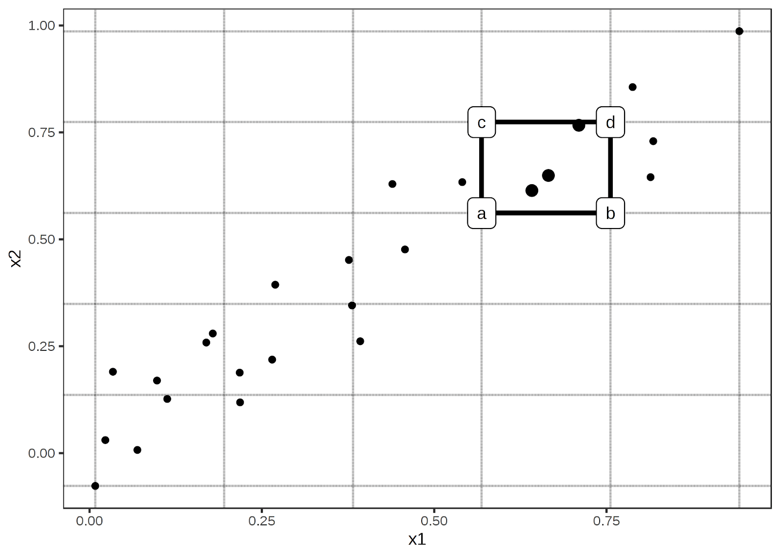
Img credit: Interpretable Machine Learning A Guide for Making Black Box Models Explainable. Christoph Molnar
Like a lot of things in life, the math may be complex, but conceptually it is pretty intuitive. To carry on the example from above, let’s say, hypothetically, you feel that both Earnings Yield and year-over-year EBIT change are good indicators of performance. If you see a security with a high Earnings Yield, but only an average EBIT, you’d be a bit interested. But you’re not betting your future on it. Same as if the EBIT change was high, but the Earnings Yield was just average. However, if you found a security that was above average in both, you’d be more likely to think that’s a lock. Even if you were to look at the first order ALE plots and see that a high Earnings Yield plus a mediocre EBIT should yield you a higher return, you know in your heart that both factors indicating a winner is the safer bet. It’s like if you were trying to buy a cheap, reliable car. You wouldn’t want super cheap but barely reliable, or super reliable but suspiciously cheap (there’s something fishy going on). You know the sweet spot in the middle is your best option. It’s easy to understand, but difficult to put into concrete terms.
Luckily, our second order ALE plots show us exactly that. They allow us to combine features and suss out the extra effect that exists due to the correlation between them. For instance, view this sample chart:
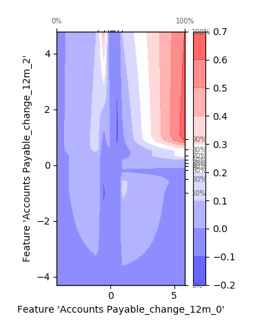
We can clearly see the added effects due to correlation. In certain points the effect is constructive, leading to a larger change in predictive values, and in areas it is destructive, reducing the prediction. Theoretically we could add more features to our chart to display the added effects of multiple features, but unfortunately our stupid 3-dimensional universe really limits the usefulness of such a chart.
As you can see, the second order ALE plots give us access to additional information about how our predictions are being made. The interplay of factors is not an easy thing to predict, but the information is vital for fully understanding and improving our model. Creating a Machine Learning model is like assembling a team of people: all members of the team need to be able to work together. Billy and Carol might both be wonderful and productive people on their own, but if you put them together and all they do is fight, it's going to be a net negative result for the team. Compatibility is important both in people and in machine learning inputs. Second order ALE plots assist us in understanding this compatibility. And when combined with the first order plots that we've spoken about previously, we're starting to open up this black box and get a solid understanding of our model.


